
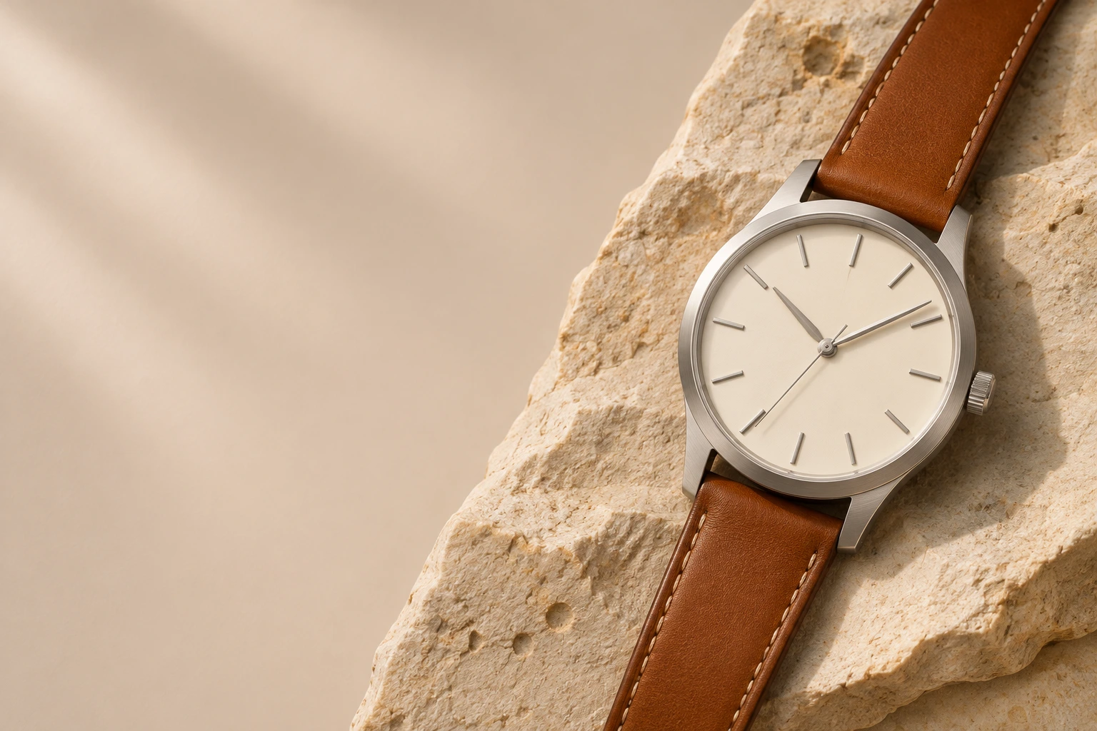
A watch dial sits at the edge of a sleeve and quietly repeats the colours in your clothes. Choosing a dial colour for everyday style is less about finding one correct shade and more about choosing a tone that suits your routine. The guidance below is general; the right answer depends on your wardrobe, your settings, and how much you want the watch to be noticed.
Start with the Wardrobe You Actually Wear
Take stock of the clothes you reach for most. If your daily uniform is built from navy, grey, white, black, and denim, a neutral dial will integrate easily. If your wardrobe already includes earth tones or strong accents, a dial can echo those colours or provide a calm counterpoint. The useful question is not “Which dial is most interesting?” but “Which dial will look deliberate with the clothes I wear most?”
Note whether those clothes are mostly cool-toned or warm-toned. A cool grey suit and a warm cream sweater ask different things of a dial. This is a case-by-case decision.
White and Off-White: The Everyday Neutral
A white or off-white dial is visually light and usually easy to read against a dark strap or case. It makes a watch feel open and uncluttered, which suits minimal everyday dress. Off-white, cream, and ivory are warmer than bright white and sit more easily beside beige, brown, and olive. Bright white can look crisp with navy and grey, but it draws attention to the watch.
White dials are not automatically formal or casual. A clean white dial on a simple strap can move from office to weekend. For a pared-back look, the ceramic-style category is a useful place to compare options. Choose a white that relates to your shirts and outerwear rather than competing with them.
Black and Charcoal: Contrast and Composure
Black dials offer strong contrast and a composed, low-key presence. They work well with tailoring, dark denim, and deep-toned knitwear. Charcoal and dark grey are softer alternatives that keep the same definition without the full weight of black. If your wardrobe is mostly dark, a black dial will blend in; if it is mostly light, it becomes a focal point.
A black dial with a leather strap is a familiar combination: it reads clearly and suits many everyday settings. The round leather category shows how strap colour and dial tone change the overall impression. Black is not the default for everyone. In warm weather or with a very light wardrobe, it can feel heavy.
Muted Colour: Blue, Green, and Slate
Colour dials work best when restrained. Navy and slate blue sit close enough to neutral to wear often, especially with denim, grey, and white. Deep green can work with earth tones, navy, and cream, while a grey-blue or muted teal offers subtle interest. These shades tend to read darker in person than in photographs, so view them in daylight if possible.
Brighter colours can be enjoyable, but they ask more of the outfit. If your wardrobe is conservative, a muted colour is easier to repeat. If you already wear colour confidently, a stronger dial can serve as an accent. Treat colour as a tool for balance.
Metallic, Champagne, and Textured Dials
Silver-white, champagne, and lightly textured dials change with the light. Champagne is warmer and can sit comfortably beside brown leather, cream, and olive; silver-white is cooler and pairs naturally with grey, blue, and black. Texture can make a dial appear lighter or darker depending on the angle, so a watch that looks subtle in a shop may look more reflective at a desk.
These finishes are not inherently dressier or more casual. A textured dial on a simple strap can be an everyday piece; a plain metallic dial can suit an evening setting. Choose the level of shimmer you will actually wear.
Consider Light, Season, and Setting
Dial colour is affected by the light around it. Office lighting, daylight, and evening interiors can make the same dial look warmer, cooler, lighter, or deeper. If you move between settings, a mid-contrast dial—neither stark white nor deep black—is often the easiest to live with. It gives enough definition to read clearly without dominating the wrist.
Seasonal dress also matters. Darker winter clothing can make a light dial feel like a deliberate lift, while a dark dial may feel more natural with heavy coats. In summer, lighter dials often sit more easily beside pale shirts. None of this is fixed. If you wear one watch most days, choose the dial that works across the widest range of your real life.
A Practical Shortlist for Choosing
When two dials seem equally good, use a short checklist:
- Name the three outfits you wear most and check which dial repeats or balances their colours.
- Identify your most common setting—office, studio, campus, or weekend—and choose the level of contrast that suits it.
- Decide whether you want the watch to blend in or serve as an accent; both are valid, but they lead to different choices.
If you are still unsure, start with a neutral dial and add variety through strap colour or a second watch. A dial colour is not a permanent commitment to one style; it is a practical part of getting dressed. For questions about specific TENSEAMEET styles, the contact page is the right place to ask.